These were the questions we pondered when a well-established educational charity institution required additional space for their 50-year-old, two-story corporate office. The existing office, though unremarkable in appearance, held significance within the collective memory of the institution and was desired to be retained for its historical value.
The office was always bustling with activity and had previously undergone a retrofit, so any expansion on top had to be executed in a way that wouldn’t disrupt its functioning or cause damage to its interiors through intrusive structural modifications.
Hence, the challenge was to intervene in a manner that wouldn’t affect the existing office’s operations or harm its interiors.
There were several contextual factors to consider, such as the location on a prominent city road, the presence within the century-old campus, and its adjacency to the sports ground.
The City Artery:
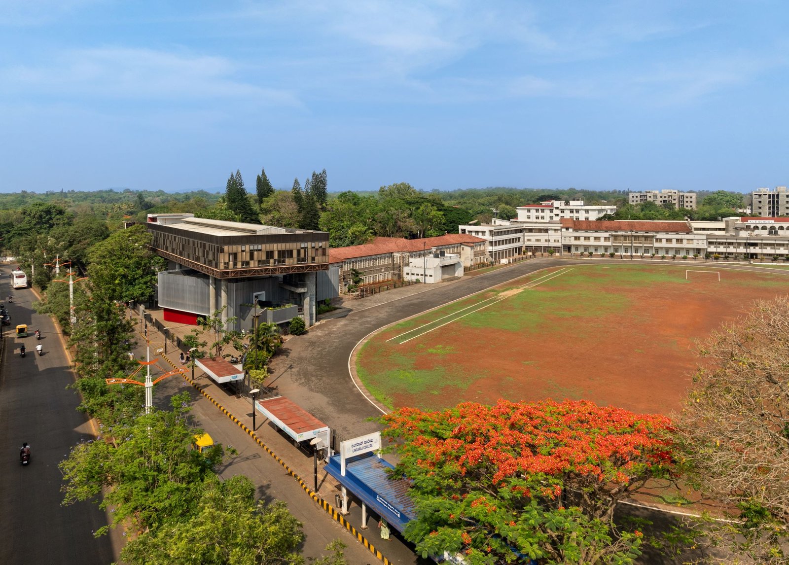
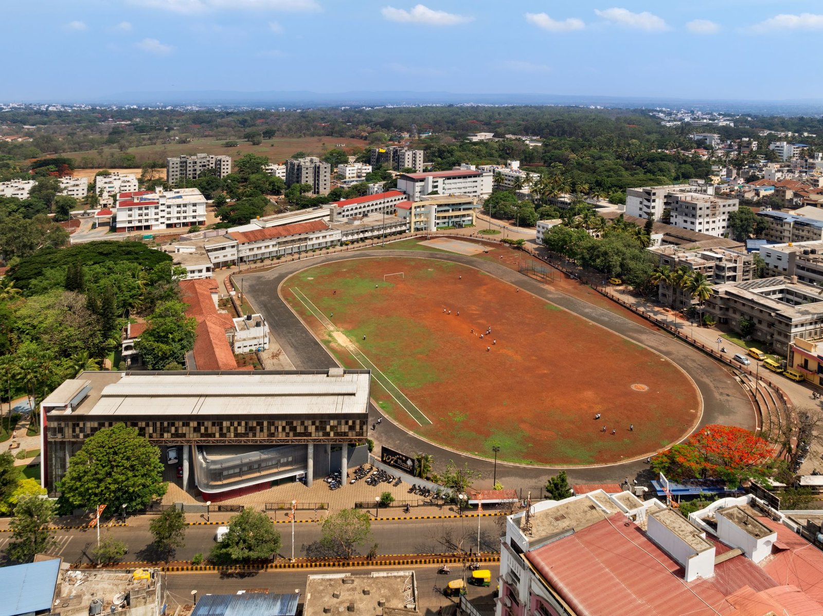
The proposed building needed to respond to its various contexts. As part of a sprawling hundred-acre educational campus, the structure occupied a significant position on a major road in Belagavi. It was essential for the building to establish itself as a visual landmark along this important city road.
The Campus:
The new building would also serve as one of the frontages of the century-old campus, which held great historical importance for the charity organization. Due to the abundance of trees and the low-lying nature of the buildings, the campus appeared as a long perimeter wall from the city, offering limited views of the interior. This presented an opportunity to create an intervention that would enhance the campus’s identity and make it recognizable.
The Sports Ground:
The campus’s sports ground bordered the head office building. While the existing building went largely unnoticed from the ground, the new addition would be a part of the peripheral edge of the sports ground. Thus, the building had to respond to these three contexts and be viewable from these vantage points.
Strategy:
After thorough analysis, a three-fold response to the requirements was conceived:
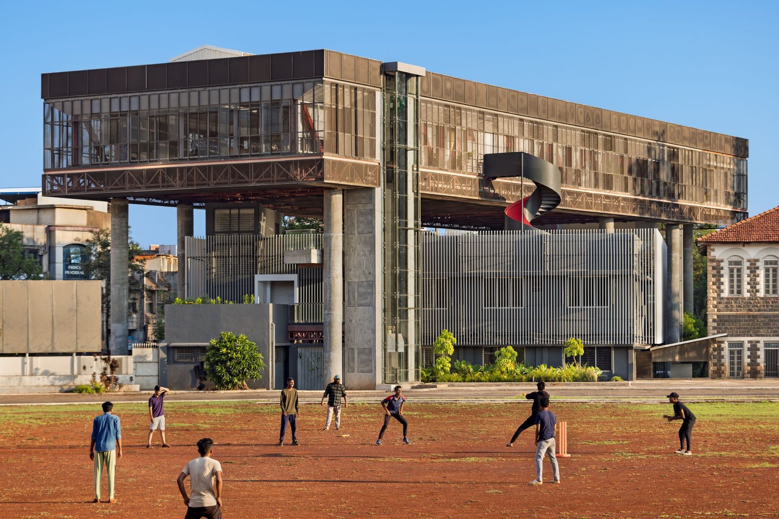
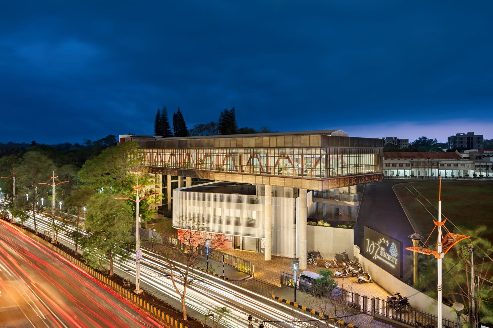
- The new structure wouldn’t merely be an extension or continuation of the lower floors. Instead, it would be a floating structure above the old building, barely touching the ground.
- The building had to adapt to the three distinct micro-contexts: the road, the colonial-era campus, and the adjacent sports ground. Its height was limited to 15 meters due to fire regulations, and its footprint was constrained by road setbacks, existing buildings, and proximity to the ground.
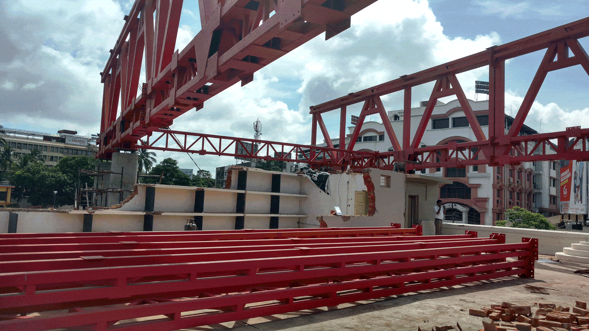
- The construction of the new building had to be carried out without disrupting the functioning of the existing campus.
Resolution:
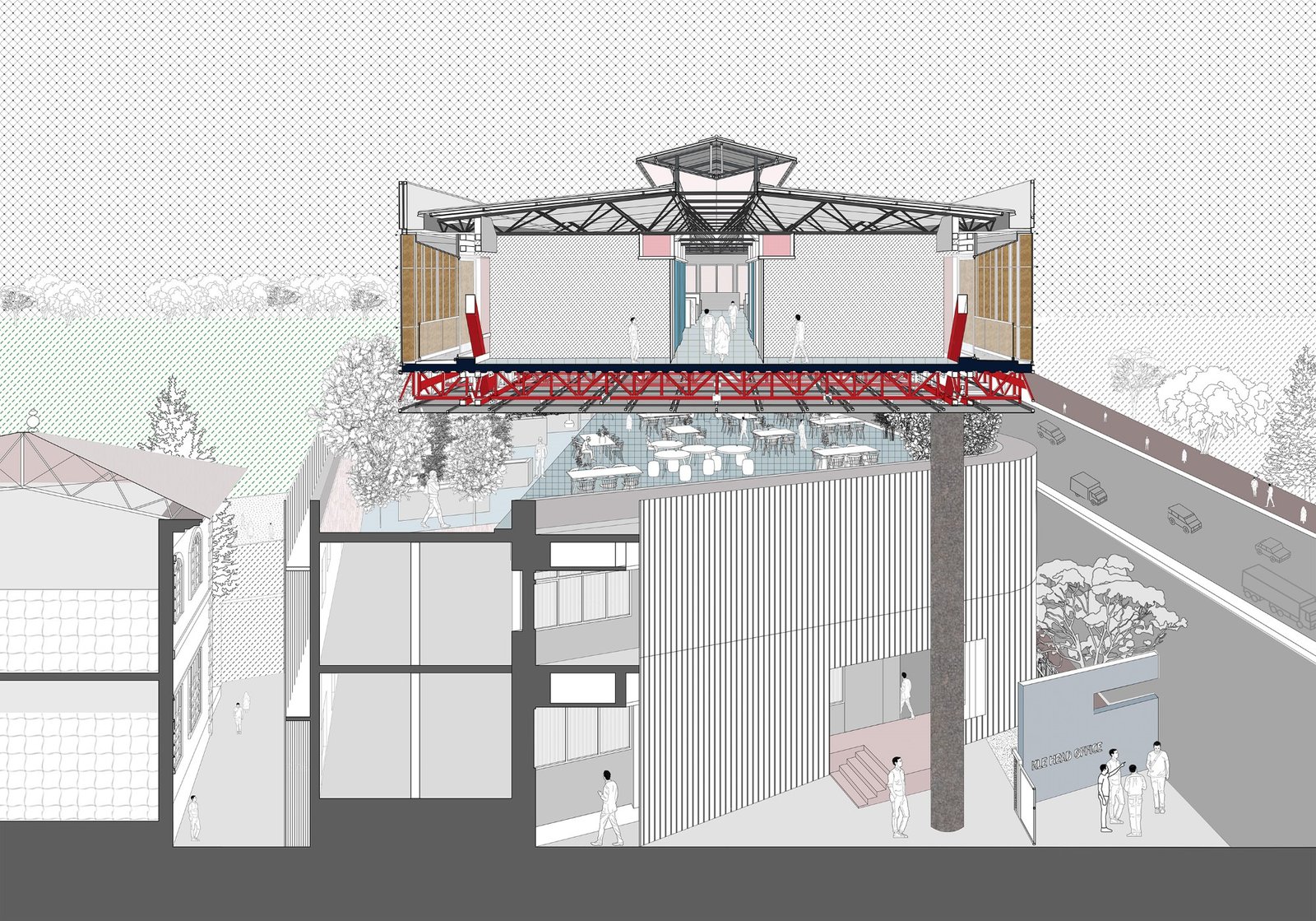
Structure as Space:
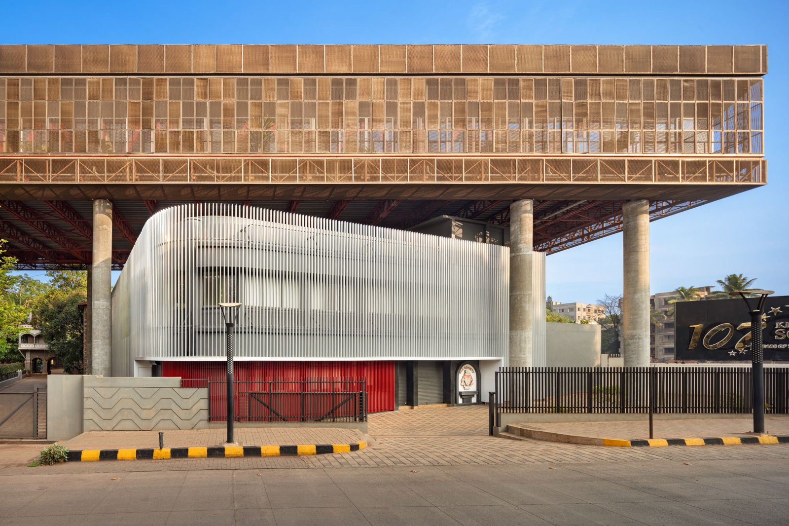
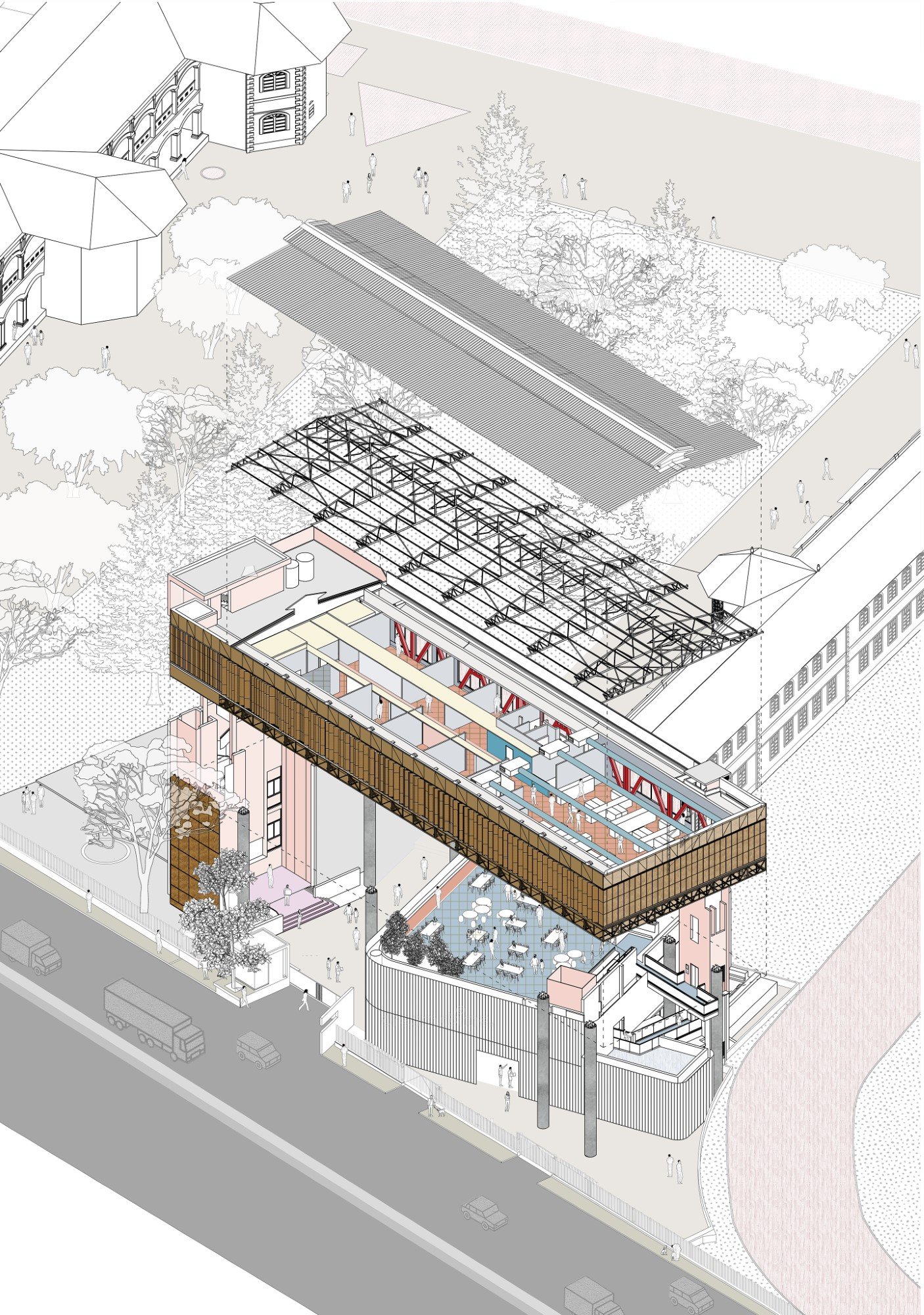
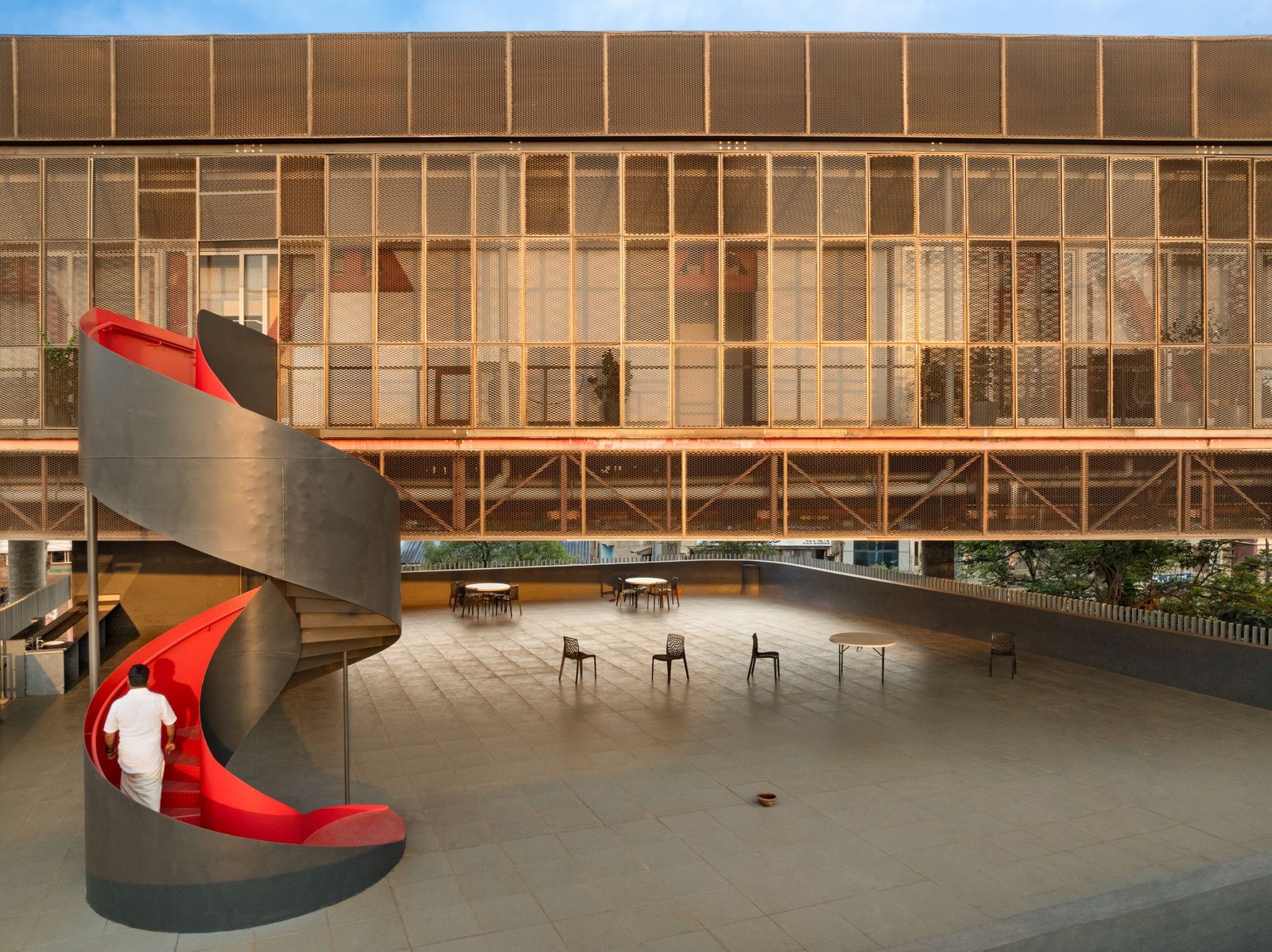
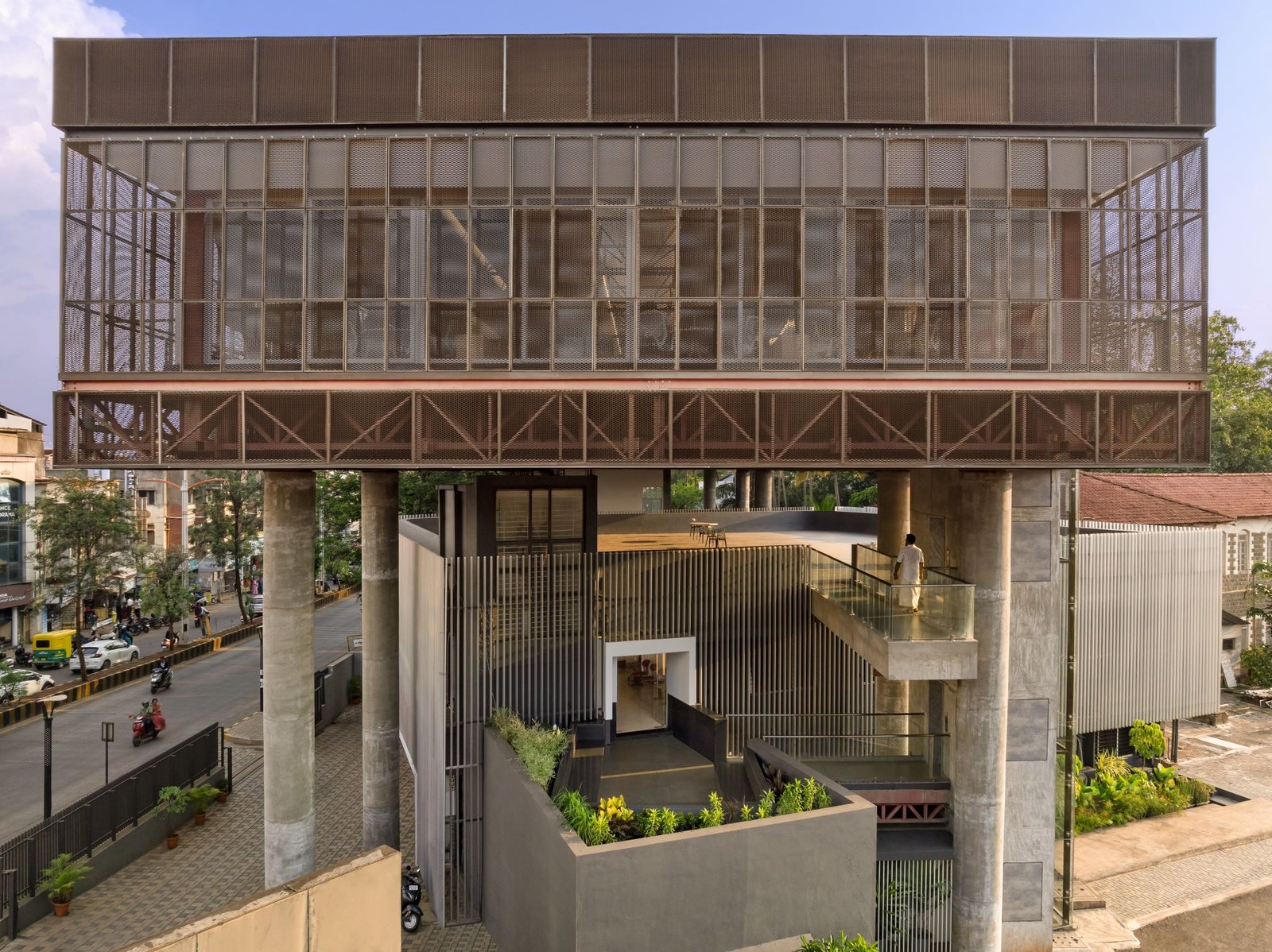
The proposed addition was conceived as a hovering space above the existing building, causing minimal disturbance at ground level. At its core, the design featured a space between two full-floor-height edge trusses. These trusses were supported by only eight carefully positioned cylindrical RCC columns, avoiding obstacles at ground level.
These peripheral columns allowed for a seamless and uninterrupted interior space of approximately 1000 sq.m. The width of the office on top was limited by the existing context and the need for daylight penetration throughout the interior. The length of the space was similarly restricted by the ground on one side and a historically significant garden on the other.
In elevation, the design resembled an inverted L shape, with a vertical arm containing circulation and a lobby, and a horizontal arm floating over the old building and extending over the sports ground. The vertical circulation element anchored the building visually to the ground on one side while giving it a floating appearance in the background of the sports field on the other.
The L shape of the building created an entry portal from the road to the campus, aligned with a central tree-lined avenue that showcased several heritage structures. These structures were framed through the triple-height entry portal, offering a captivating view of the campus from the road.
Verandah as a Second Skin:
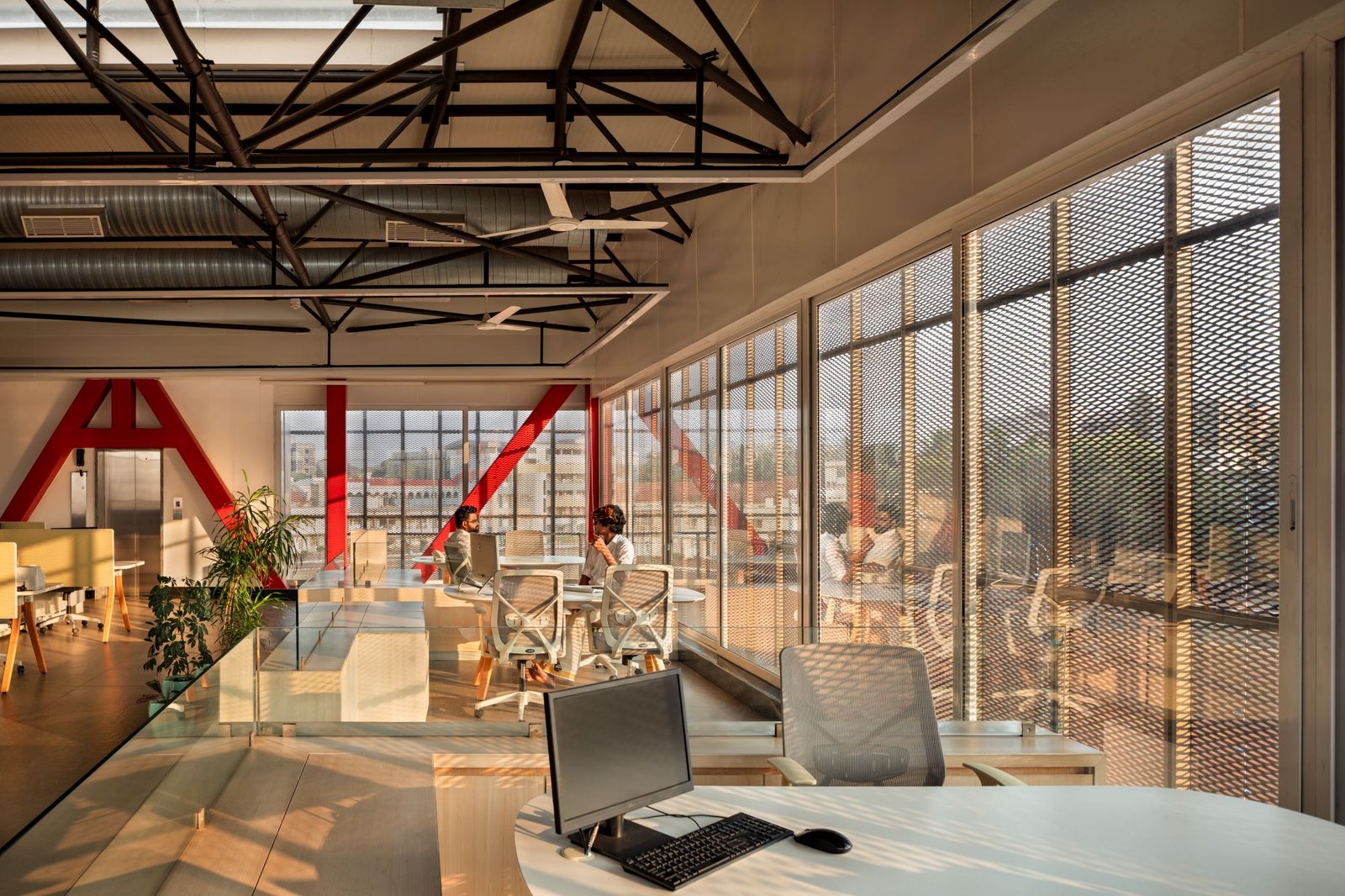
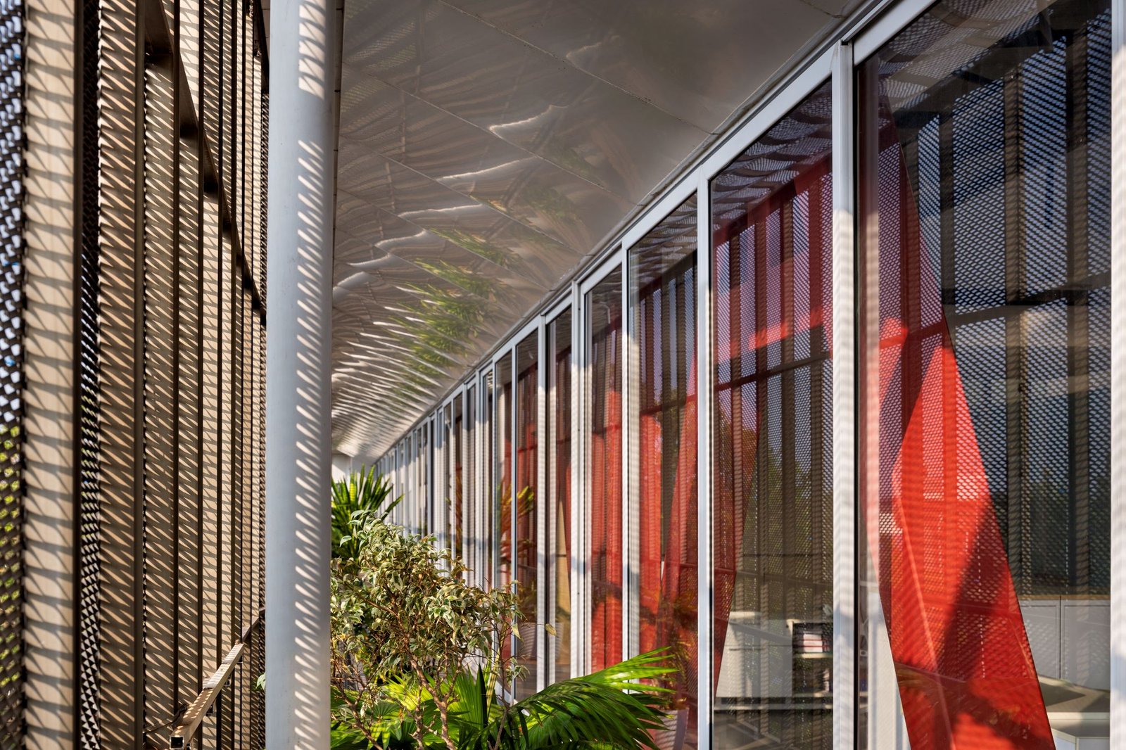
The simple box of column-free office space was enveloped by a continuous verandah, drawing inspiration from the ubiquitous feature of colonial architecture in the subcontinent. The verandah served as both a social space with diverse uses and a climatic buffer, shielding the interiors from the region’s harsh rain and sun.
This verandah provided breakout spaces for the offices and acted as a transitional zone between the interior and exterior. The floor-height trusses, painted in deep red, served as sculptural elements defining the boundary between the core office space and the verandah. Aluminum sliding doors acted as an interior envelope, providing easy access to the verandahs.
An expanded mesh aluminum skin with operable vertical fins further enhanced climatic control and transparency along the longer eastern and western facades, filtering direct sunlight. The views from the interior spaces were layered and framed by the trusses, aluminum glazed windows, plants in the verandah, and the lightweight aluminum mesh screen. This allowed the office spaces to create a sanctuary, shielding occupants from the city’s bustle while allowing glimpses of the surrounding campus through layers of transparency.
The interior spaces benefited from abundant natural light, ventilation, and a simple palette of whites and bright colors, complemented by lush foliage. Programmatically, the offices were divided into three main areas: the entrance lobby with the chairman’s chambers, a middle section housing private offices and meeting rooms, and a rear section with open office cubicles offering views of the city and the sports field. Exposed roof trusses and a clerestory skylight along the center of the roof defined a spine, emphasizing the main circulation corridor.
Interstitial Space:
Functionally and conceptually, the new addition needed to operate cohesively with the existing building while visually distinguishing itself. The two structures were connected by a glass elevator facing the sports field, offering serene views of the campus and its surroundings as one traversed vertically through the office complex. This glass elevator served as a physical link between the two buildings, enabling users to temporarily step out of the offices while still enclosed in a glass box before reconnecting back. This ritual of transportation emphasized the separation between the old and new elements.
The terrace of the old building became an interstitial space that could function as an event space or terrace garden. This intermediary space acted as a buffer and a transition point, visually and programmatically bridging the gap between the old and the new. Accessible from the lower floors via a regular staircase, the terrace now also features a sculptural circular staircase connecting it to the new addition above. The placement of the new addition in relation to the old structure created a condition where parts of the terrace were open to the sky, while others were covered by the hovering space above.
Several Responses:
Despite its seemingly simple appearance, the new addition possessed multiple layers of complexity woven into its design. It responded to the road by presenting itself as a linear screened box parallel to the road, partially concealed by foliage. It served as an entryway portal to the campus and acted as a backdrop for the sports ground, visually anchoring the campus.
Overall, the newly created office space endowed the organization with a fresh identity and presence, while also serving as an entry portal for the broader campus. The offices, with their blend of private chambers and open work desks, greatly benefited from the exterior verandahs, shielding the interiors from the elements.
In its various nuances and details, the design addressed multiple functional, contextual, and climatic considerations through straightforward strategies.